Living Color
An explosion of color brings energy to a Houston, Texas home.

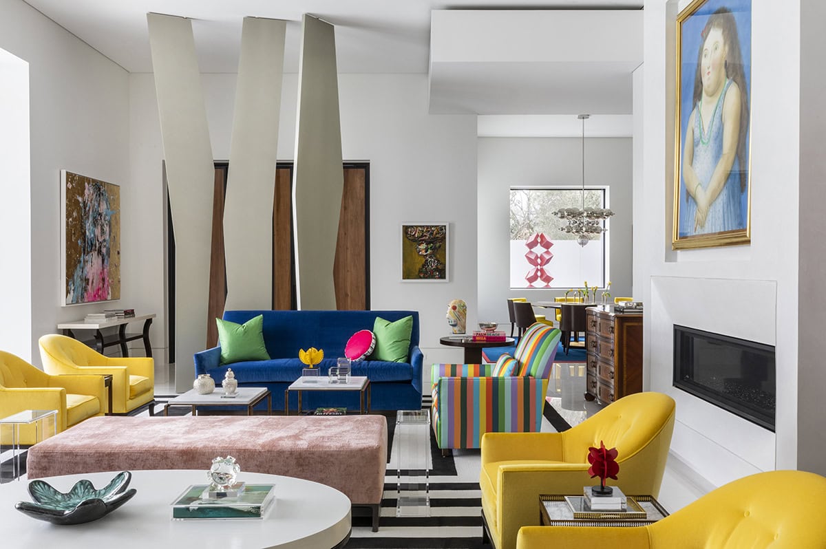
The palette in this Houston, Texas, home incorporates bright primary colors in both the art and the furnishings, yet it does not overwhelm.
What makes a home feel elevated? While some might argue a slew of sun-drenched windows or minimalist, low-profile furniture, most would agree that a sophisticated space almost always boasts a neutral color palette. However, one residence in Houston’s Tanglewood enclave sidesteps tradition by embracing color. Lots of color.
The project—a collaboration of interior designer Jon Green of Indigo Interior Design, architect Mauricio Vela Carvajalino, and builder David Stone—draws inspiration from architect Luis Barragán’s portfolio of colorful, contemporary homes. Pops of pigments are present with the client’s art and furnishings, but the home’s palette is further enhanced by the bright cabinetry from Eggersmann. Though the German company has been making premier, customizable storage solutions since its founding in 1908, bright, bold hues are a departure from its often-sleek spaces.

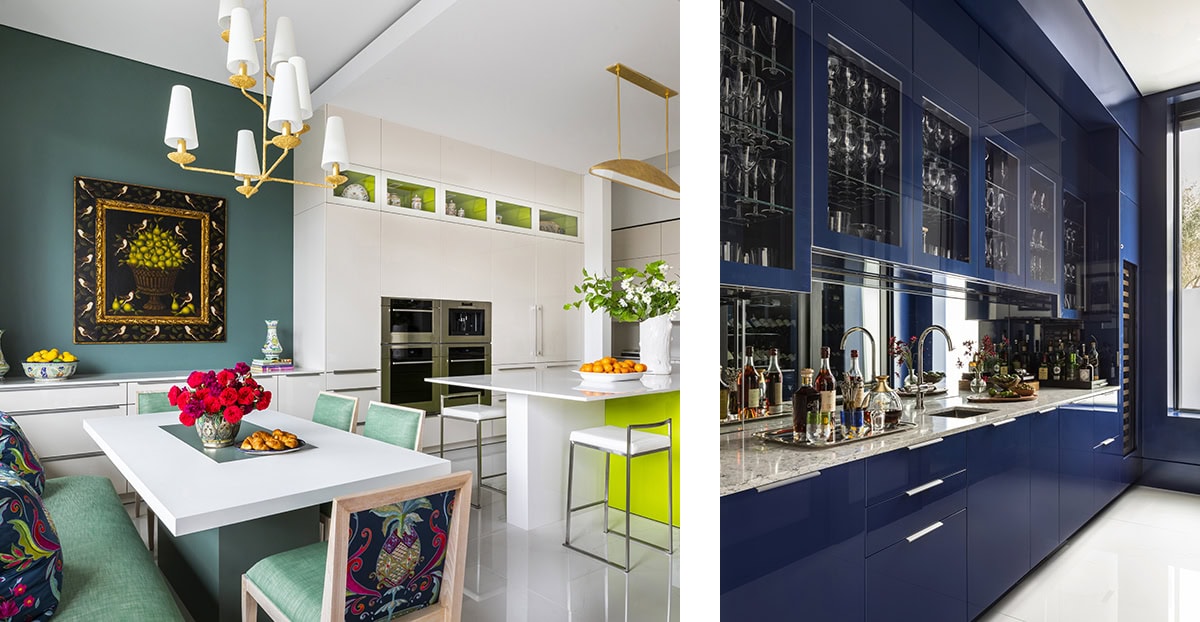
Left: In the kitchen, lime green cabinets by Eggersmann take center stage. Refrigerator and freezer by Sub-Zero, wall ovens, coffee system, warming drawers and cooktop by Wolf. Custom cabinetry throughout, by Eggersmann.
Right: The bar area has a calming blue on the cabinets. Sub-Zero ice maker, refrigerator drawers, and wine storage. Cabinetry throughout, by Eggersmann.
“We typically don’t do a lot of color at eggersmann, but the client here is from Mexico and loves color,” explains Andrea Villamarin of Eggersmann Houston, who worked on this space. “When you go into their house, there’s color everywhere.”
The kitchen boasts a custom lime-green island to highlight the verdant tones in the room’s art. While the island commands attention, Villamarin cleverly incorporates glass-fronted cabinets with a matching green interior to draw the eye upward. “They wanted to have something open on that whole elevation,” Villamarin explains. “It’s just a nice accent: It’s there, but it’s not so much in your face.” Between the neon bursts, a series of white lacquered cabinets provides a visual breather.

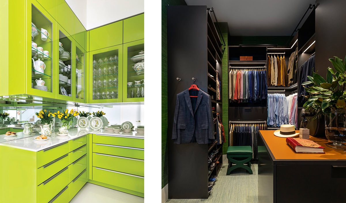
Left: Eggersmann’s lime green abides in the butler’s pantry, which has ample storage and counterspace for prep work.
Right: His wardrobe is tricked out in a dark, moody, masculine brown, with warm orange accents.
In the bar they went with cabinetry covered in a custom cerulean. “We painted the metal frame on the back the same blue, so it matches the whole space,” says Villamarin.
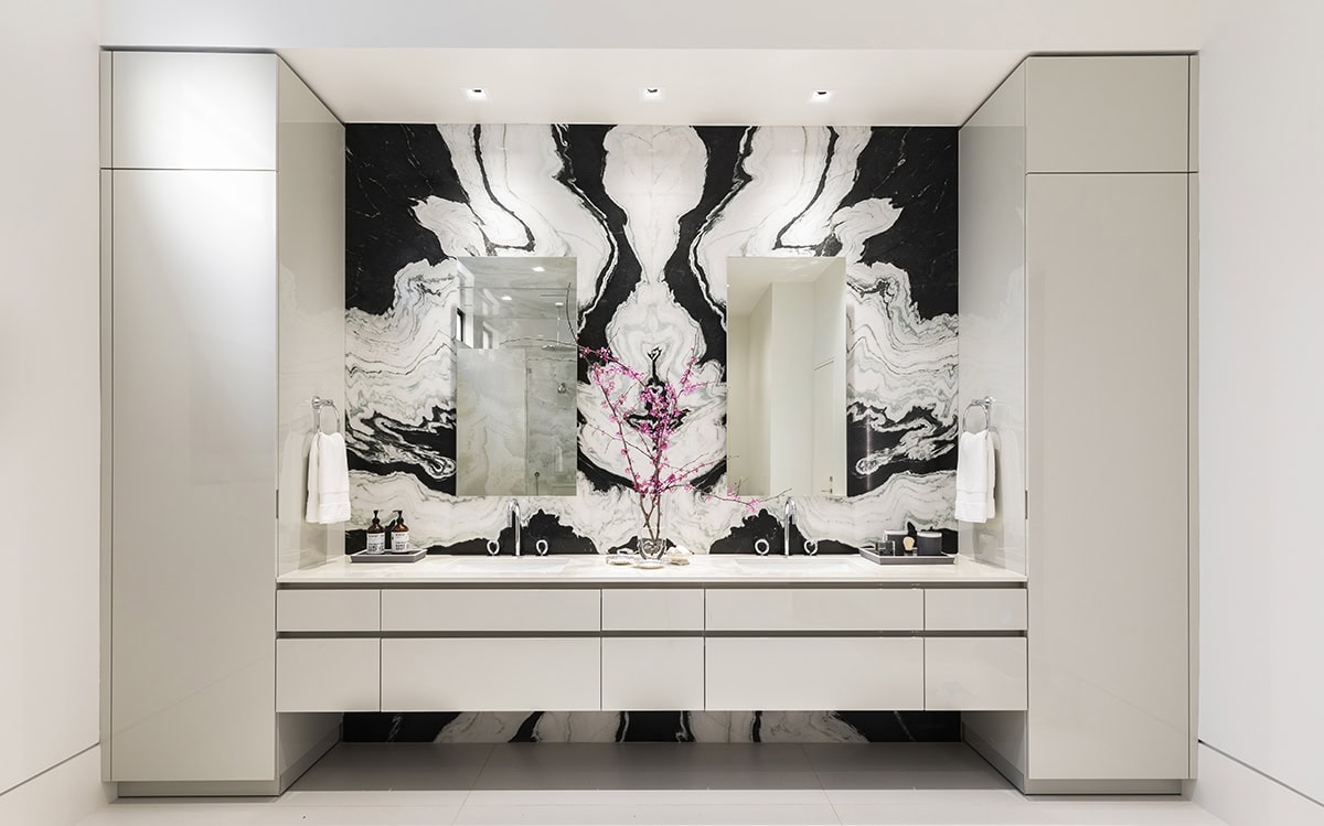
While the public spaces boast a rainbow of hues, the private quarters feature a more subdued scheme. In the primary bathroom, the minimalist white storage brings an open, weightless feel to the stone seen throughout. The primary closet, which boasts custom features like a watch winder, has a masculine and moody feel with its warmer hues.

The primary bath is outfitted in dramatic black and white, as an antidote to the vibrant color elsewhere in the home.
But, in this home, a dimmer palette doesn’t mean dreary. Villamarin shares that the client selected an energetic orange insert to use in the closet. “It’s a nice accent, but doesn’t overpower,” she says. After all, with the right combination, a bright color doesn’t have to command too much attention. Rather, it can make a home feel effortlessly elevated.
