Light Fantastic
Workshop APD transforms a dreary Turtle Bay apartment into an airy duplex.
In the lounge-style living room, a custom carpet from Tai Ping echoes the pattern of the LED lighting overhead. The view is reflected in the polished stainless steel that surrounds the windows.
In a somewhat run-of-the-mill, post-war building in Turtle Bay, Workshop APD created the ultimate bachelor pad for a recently divorced client. Workshop APD founder and principle Andrew Kotchen says, “Our client really wanted a space that gave him a redefined persona—different, cooler, something that he could entertain in. He didn’t care about the building he was in, he cared about the space. Like any 80’s post-war buildng, it was really non-descript. Nothing about it was interesting, and the apartment itself was a duplex that was cut up to a bunch of small spaces with undersized, inadequate windows. The best thing about it was really the unobstructed view of the Chrysler building.”

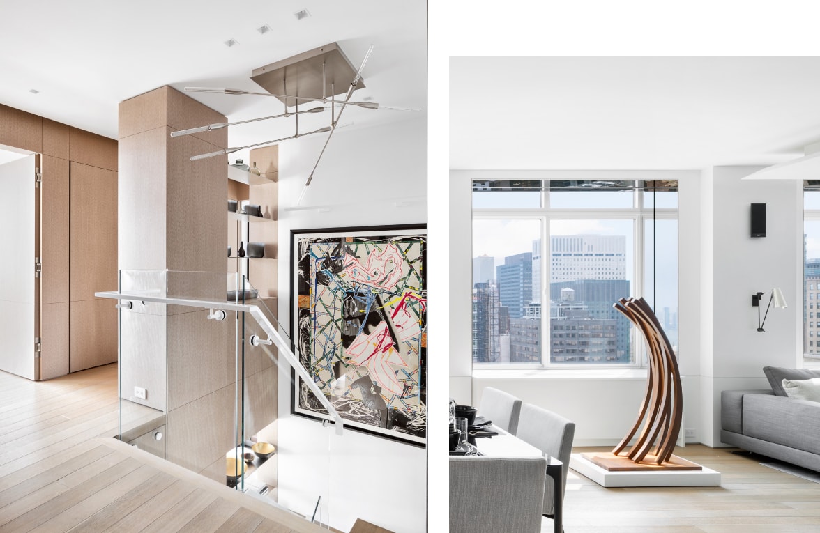
Left: In the upstairs foyer, light from the bedrooms is filtered down through the transparency of the staircase. The white oak floors and veneers add warmth to the modern space.
Right: The space between the living and dining rooms is filled by a large-scale graphic sculpture.
Workshop APD is known for their light-filled, innovative spaces. “We are big on bringing the daylight into every space we work on. In urban settings you often have windows on only one side, or light is blocked by surrounding structures. But we spend a lot of time on what we call ‘the spaces between,’ which allows us to let natural light in. It changes everything.”
In order to achieve maximum daylight in the space, they opened up the windows and used a visual trick that they frequently employ. “We applied polished stainless steel flashing around the window openings. It expands the view and reflects light into the space.”
They transformed the living room into a combination lounging pit and informal media viewing area by surrounding the perimeter of the room with a large, fragmented sofa that is broken up by table inserts and removable ottomans. It breaks where the living room meets the dining room and kitchen, allowing for the space to be open, yet defined at the same time. The geometry of the room is accented by the LED ceiling lighting, which is repeated in the pattern of the custom, Workshop APD-designed rug by Tai Ping.
On the second floor, a master bedroom and bath suite, and a guest suite open up to a light-filled foyer. Kotchen says, “We reconfigured the existing staircase, connecting the levels but opening it up as much as possible. There was a sense of compression because of the support column, but once you get past that, it opens up and is filled with daylight.” They added elements that were decorative but also helped with light flow. “We exended risers out of the column that define the space but are open and feel very loft-like. And we added as much transparency as we possibly could, with glass, open space, and reflective surfaces. All of this allows light to bleed into the first floor spaces, and add to the loft feel.”

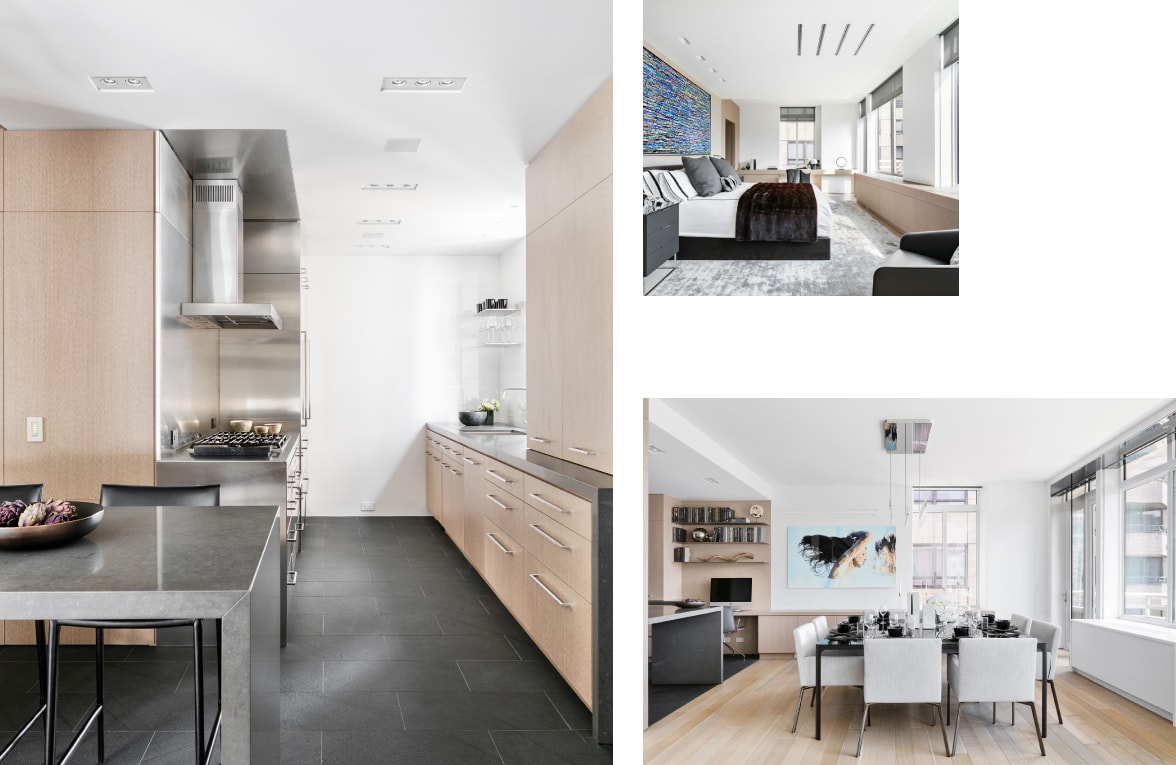
Left: In the kitchen an integrated Sub-Zero refrigerator with a custom panel disappears into the space. The floors are flamed slate slab, and dark stone countertops are in contrast to the white oak cabinets.
Top right: A custom silk rug by Tai Ping adds softness and texture to the master bedroom.
Bottom right: The dining room is a transitional space between the open living room and the kitchen. A Holly Hunt Standard Edge chandelier hangs over the table.
The architects also employed their signature approach to surfaces, layering texture and a simple palette throughout the duplex. “The greatest compliment we get when we take someone through a space is when they want to touch every surface,” says Kotchen. Using cerused or wire brushed wood, smooth or leathered stone, glossy marbles, and layers of textured fabrics mixed with polished metals and glass creates tactile layers, and prevents the rooms from feeling clinical. “We talk a lot about ‘livable modernism,’ creating a warmth to rooms that feels real and inviting.”
But ultimately, it’s the light that seals the deal on any design the firm creates. “Natural light changes the attitude of everything. Daylight is one of the most important things in this stressful modern world—it’s all related to health and happiness. It’s hard to achieve in an urban setting. You don’t realize why you feel so good in certain spaces. It’s mostly about light.”

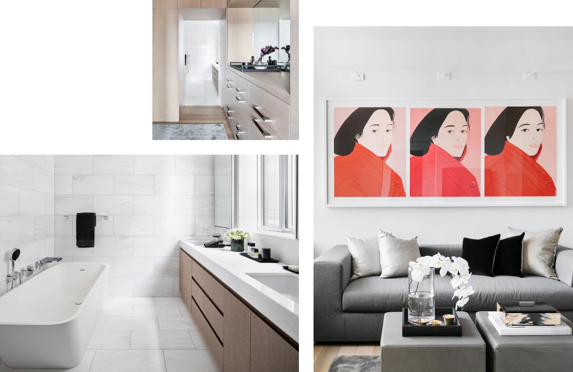
Top left: A dressing room off the master bedroom leads to the bath.
Bottom left: In the master bath, a mix of polished white marble and mosaic tile creates texture in the mostly white room.
Right: The office/sitting room continues the lounge-like feel of the living room.
