Join the Brownstone Boys for an Astonishing Brooklyn Renovation
Brownstone Boys and real-life partners Barry Bordelon and Jordan Slocum put a distinctly Brooklyn spin on an historic townhouse.
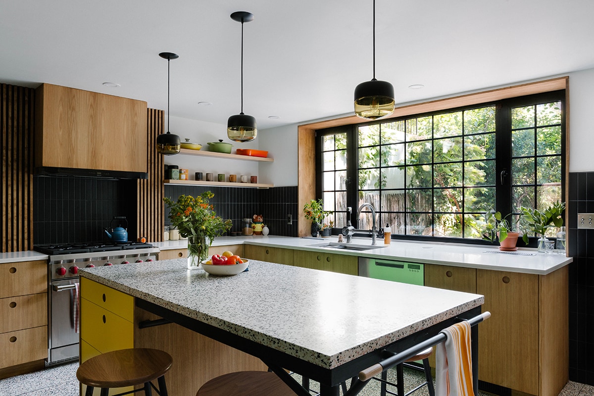
Paying homage to the brownstone’s historical footprint, the Scandinavian-inspired kitchen is situated at the garden level, exactly where it was when the home was built in 1890. White oak cabinetry, a custom hood above the Wolf stove, and a stacked matte-black tile (a design element repeated on every floor of the home) are juxtaposed with a punchy yellow island topped with terrazzo. An expansive set of cast-iron windows look out into the courtyard. Refrigerator by Sub-Zero. Dishwasher by
Fisher & Paykel.
Finding a worn-down Brooklyn townhouse these days is rare; dilapidated structures were snatched up for a bargain and renovated when the Brooklyn real estate boom first began. Yet a few historic brownstones, though outdated and stale, are still out there, waiting for a new homeowner with vision, guts, and a whole lot of patience, to make them their own. Such was the case with Barry Bordelon and Jordan Slocum, better known as the Instagram-famous design duo the Brownstone Boys. They were tasked with reimagining an entire 4,000-square-foot, three-family historic townhouse with a generous dose of structural issues and desperately in need of good old-fashioned TLC as a single-family structure overflowing with an eclectic mix of colors, textures, and patterns—while still honoring the property’s historical design details.
Like most gut renovations, particularly those involving homes built in 1890, their creative journey spanned a year and a half and endured twists and turns, starting with the addition of a basement, to give the tiny cellar an additional six feet of height.
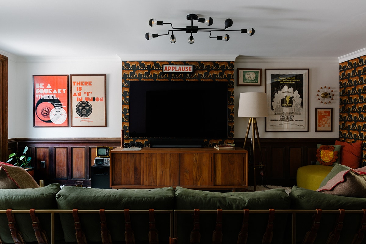
Off the kitchen on the garden level is the media room where midcentury modern pieces and traditional muted tones of mustard and olive are mixed with vintage posters and television sets, and plenty of patterns, color, and cheeky decor details, like the retro APPLAUSE sign above the television.
“After digging down so far under the house, we found this huge boulder that we physically couldn’t get out of the house,” says Slocum of the basement’s intense excavation process. “So, we had to dig down deeper to drop the boulder even lower.”
Always up for a challenge, Slocum and Bordelon were excited to interpret their client’s idea of a dream home in this now five-story piece of history. “Our client is a really colorful individual, which excited me and scared Barry a little bit,” laughs Slocum, adding that Bordelon prefers a neutral sanctuary. “When our client told us he wanted to incorporate color, that just excited me and I ran with it.”
Left: One of the home’s many fireplaces was half original, half remodeled in a dated ‘90s style, presenting an interesting challenge. “We proposed starting fresh and sourcing one of the more antique-looking tiles, but the homeowner really wanted to just have fun with it,” says Jordan Slocum, one half of the Brownstone Boys duo. “I think the turquoise scalloped tile with the original wood frame is a really nice marriage between the historical vibe and that modern charm.”
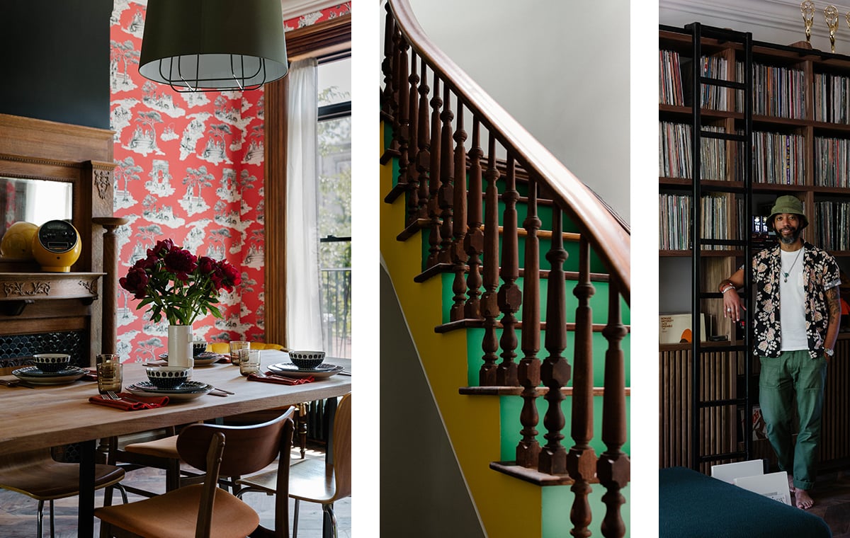
Center: The brownstone’s grand staircase risers are painted green and blue in an ombré-effect. They are the homeowner’s favorite colors.
Right: Custom floor-to-ceiling millwork is home to the owner’s extensive record collection and turntable—an essential for a bachelor in the entertainment and music world—while a matte iron ladder is as much a fun style twist as it is functional to reach the highest shelf.
Calling the homeowner “an artist, through and through,” the Brownstone Boys settled on a fun-loving color palette—but not just one or two. “We decided has a different look and feel,” says Slocum. “He really wanted to just have fun with it, and it turned out to be a really nice marriage between the historical vibe, and that modern charm.”
They moved the kitchen from the more expansive parlor floor with sky-high ceilings to the garden floor. “Brownstones in the late 1800s were designed with the kitchen always on the garden floor because it contained all the smells and had lower ceilings down there,” explains Slocum. “With this renovation, we were able to design the kitchen around the garden and in its original location.”
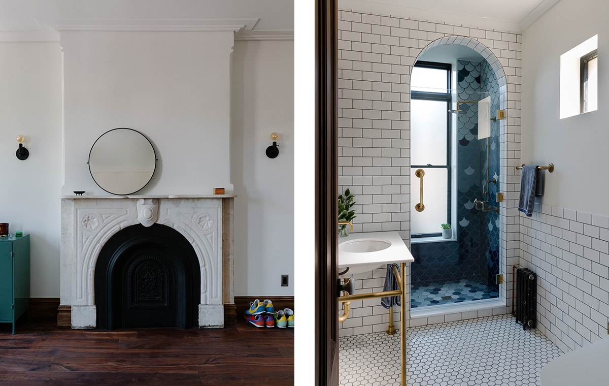
Left: A white marble fireplace in the primary bedroom is original to the home, while the milky bare walls, sconces without shades, and slim round mirror continue the minimalist palette. The brightly colored sneakers hint at the homeowner’s playful personality.
Right: “We wanted to make the parlor floor bathroom really inviting, yet also kind of a world within its own,” says Slocum. “The custom tiles were inspired by the colors of the ocean, and we ran that beautiful arch in the classic subway tile. There’s a hint of fun in that shower niche area with the window, which is pretty amazing since it is original to the home.”
The kitchen is perhaps one of the more muted areas of the home, with only one wallpaper design, albeit bold and bright, two flashy colors, and one style of backsplash tile.
“A clean Scandinavian look was the foundation for the kitchen. Our client really enjoys cooking, so we knew that it had to be a space that was extremely functional, but also where he could be comfortable. Everything has a purpose in this kitchen,” says Slocum, who adds that the large-scale window above the farmhouse sink looks directly into the garden for an extra dose of zen. “It’s a cool blend of Scandinavian white oak, vertical, matte-black tiles, and this really out-there terrazzo that we used on the island.”
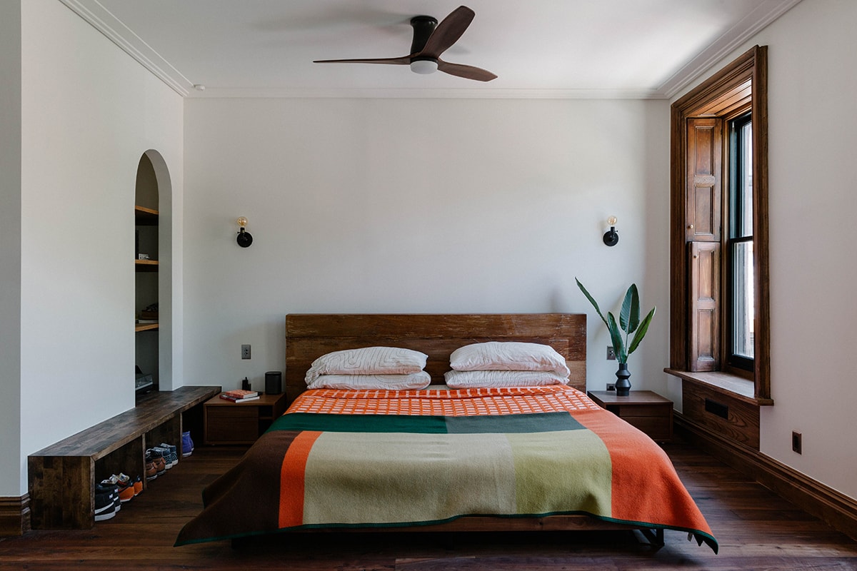
The primary bedroom is swathed in a paint color called Panda White, serving as a base for the art-collecting homeowner to add to over time. “We wanted to let his sanctuary be designed by him as he settles in and listens to the space.”
What the kitchen lacks in vibrant wallpaper, the dining area, swathed in fire-engine red Harlem Toile de Jouy by designer Sheila Bridges, more than makes up for. “He was on the wallpaper train with us,” laughs Slocum. “And the more spaces, the better for him, so we brought it everywhere, including the interior of the pantry closet. It’s just wallpaper on wallpaper on wallpaper.”
Another important element of the home are the original fireplaces, a luxurious design feature that was not lost on the Brownstone Boys. To truly give it the spotlight, they created a simple scene—simple for their aesthetic—keeping a mirror above the mantle and not much else. “We proposed sourcing one of the more antique-looking tiles, but he just wanted to have fun with it. It’s an eclectic house with lots of pattern, color, and personality. It’s still the most fun project we’ve ever done.”
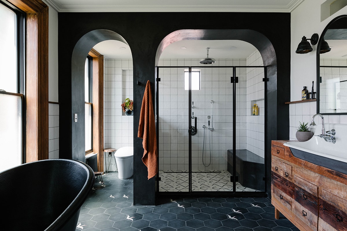
The showstopping primary bathroom is a study in blending seemingly opposite styles into one cohesive and stunning space. Designed and built by the Brownstone Boys, the vanity is constructed with vintage reclaimed wood, topped with a rustic Kohler farmhouse sink. A spacious black tub by Signature Hardware sits in front of the expansive windows. Tub and sink through Ferguson.
