Pure Or Perilous? Inside One Renovation’s Pale Palette
Creamy hues provide a firm yet flexible foundation for this stunning, four-story town house renovation.
“We chose the lightest plaster color,” says Simonpietri. “It looks almost white during the brightest hours of the day. Then it fades to its natural color—while picking movement in the reflective light
sources—in the evenings.”
Behind the red-brick facade of an Upper West Side town house hides a creamy and carefully crafted living space. Residential design studio Chango & Co. managed the design and architecture of this radical renovation, including a three- story-tall addition. But its defining feature may be the way its white walls suffuse the space with a soft glow.
“One of the goals at the beginning of the project was to help the home and structure feel free,” says Susana Simonpietri, creative director of Chango & Co. The building had been converted into an apartment building, so Simonpietri’s goal was to restore its glory. Post-renovation, says Simonpietri, “the entire home feels like a big breath of fresh air—clean, uncluttered, and visually liberating.”
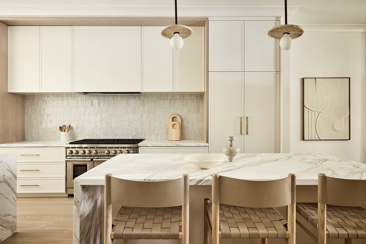
“The more utilitarian and industrial it felt, the more it would break up the space,” says Simonpietri, “so we focused on designing a kitchen that would recede into the background.” Opalescent tile from Artistic Tile forms the backsplash. Range by Wolf.
“The clients gave us a tremendous amount of trust and freedom,” says Simonpietri. “They wanted the space to feel light, with neutral colors and a layered approach.” And though some might worry about living with white, Simonpietri does not. “We very often use creams and whites in projects for young families,” she says. “White doesn’t fade and is one of the easiest colors for washing and cleaning.” Experienced with the palette, Simonpietri’s team used materials that are easy to maintain.
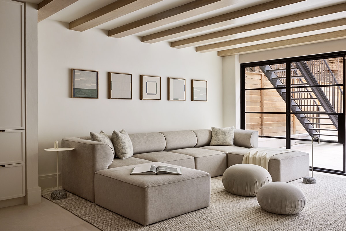
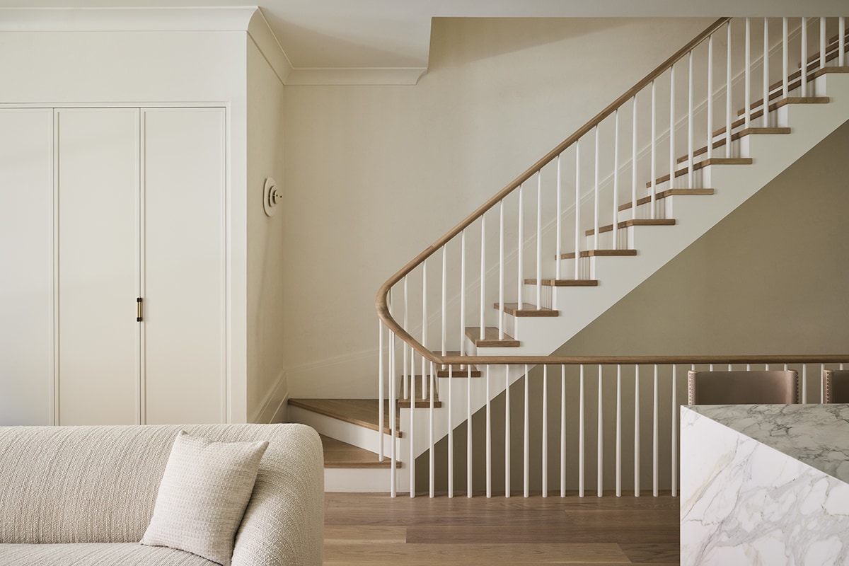
Visitors meet an open concept first floor, which flows from living room to kitchen to dining space. Simonpietri used the width of the stair stack to delineate space for additional storage and a powder room, so neither interrupts the path from the sculptural sofa to the kitchen with its two ample islands. “When you’re dealing with an open floor plan you can never lose sight of how the space is going to work,” notes Simonpietri.
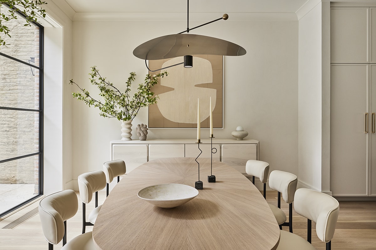
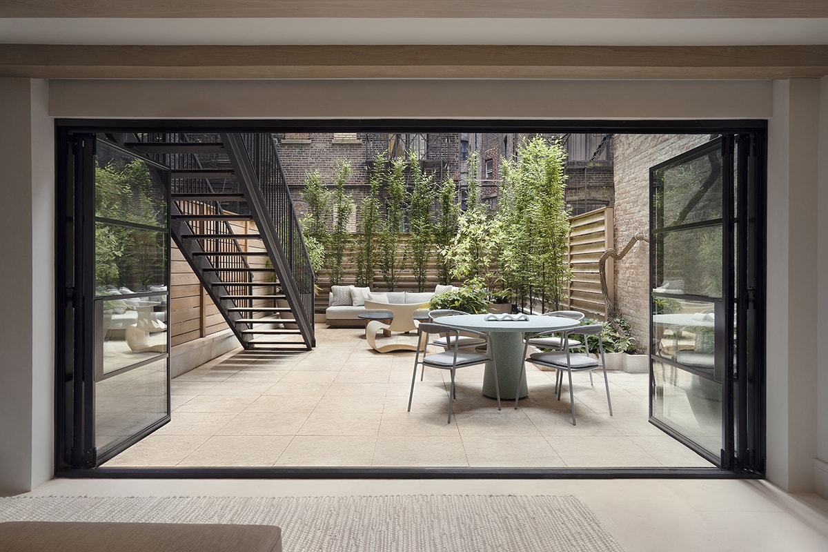
The dining area features a telescoping wall that fully opens to create unimpeded access to the home’s outdoor spaces.
The flow continues unimpeded into the dining area, where a wall of glass looks out onto a deck with a cozy dining corner for breakfast al fresco. From here, exterior stairs lead to a patio with space for grilling and a larger table and chairs on the garden level. There’s also a gathering area with seating around a stone coffee table. “We wanted to integrate the outside of the home into the inside,” says Simonpietri, “so we used limestone on the cellar floor, which is the same as the garden.”
Room for indoor fun on the garden level includes recreation space to play pool and a sizable sectional—a less formal option for hanging out than the first floor. “The downstairs is more of a lounge space for watching TV,” explains Simonpietri. This level also hosts home office space and a guest room with its own bathroom.
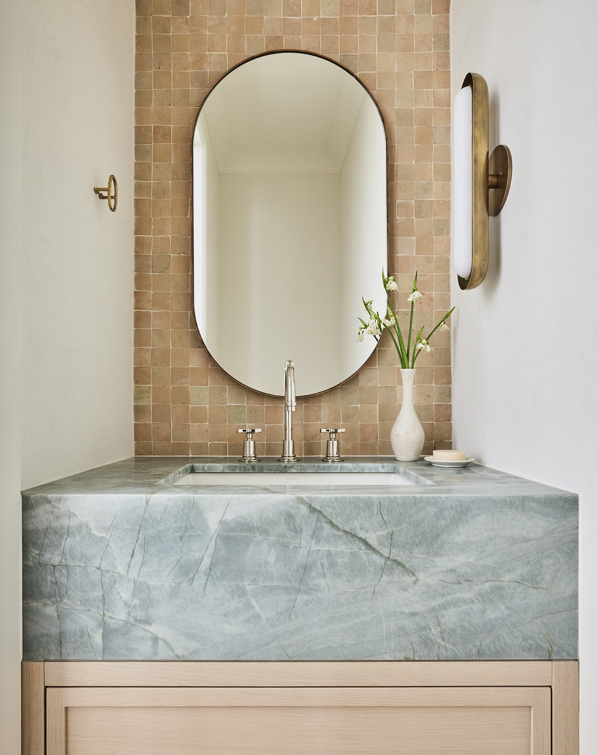
“We were really in love with the unglazed terra-cotta and green countertop,” Simonpietri says. “These colors can also be seen in the nursery and a few other spots.” Faucets by Lefroy Brooks.
“The entire home feels like a big breath of fresh air—clean, uncluttered, and visually liberating”
Most of the other bedrooms are located above. On the second floor, the primary bedroom features a particularly unique element. “The headboard that turns into a window bench is a fantastic moment,” says Simonpietri. “We had been wanting to do something like this forever.”
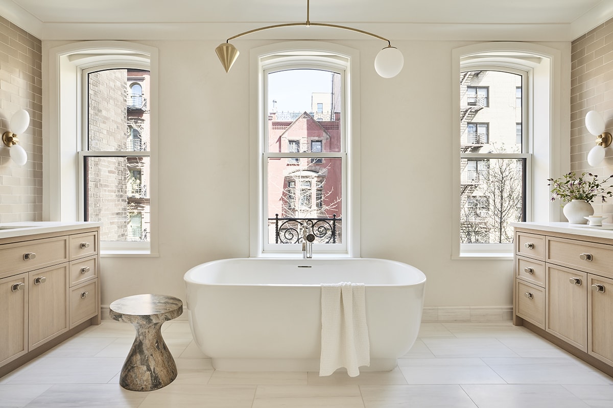
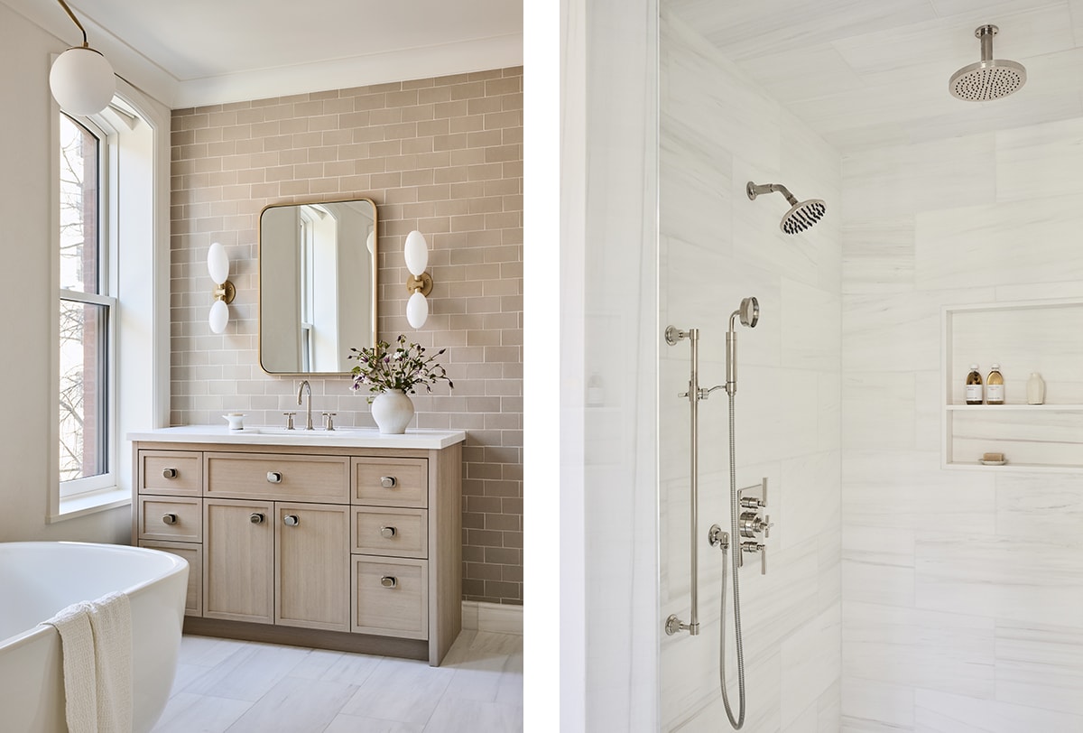
And Simonpietri calls the primary bath the moment “where all the good stuff comes together.” The beautiful tub is centered before three windows and flanked by identical vanities. “We wanted them to be mirrored because we really wanted symmetry,” says Simonpietri. Above the bath, a light fixture balances contrasting shapes, a nod toward the room’s shared nature. “The space is perfectly symmetrical, but it doesn’t mean the light had to be, so we decided to be playful,” says Simonpietri. Lefroy Brooks fixtures shine here—at the sinks, filling the tub and equipping the shower.
Adjacent to the garden, this lounge area is ideal for a casual hang.
Beautiful gestures continue on the third floor, where the team installed a supersized skylight. “This allows so much light to filter down through the stairs and makes the space feel sunbathed,” notes Simonpietri. This floor also contains a nursery, another bedroom with lantern-like Noguchi lighting, and a bathroom. Grace notes here include laundry and a wet bar.
Furnishings—including the sculptrual Amalfi chair by Patrick Naggar for Ralph Pucci International—beckon guests to the garden.
After a three-year transformation, what did the clients think of their transformed town house? “They were so enamored and thankful,” says Simonpietri. “This is one of my favorite projects and without a doubt my favorite family to work with. I think the final product shows that too.”
Bianco Dolomiti from Artistic Tile enhances the primary bath. Tub filler by Lefroy Brooks.
Left: Identical vanities on either side of the room are outfitted with Fleetwood faucets from Lefroy Brooks.
Right: The primary shower also uses the Fleetwood collection from Lefroy Brooks.