A New Geometry
Architect Andrew Wilkinson reimagines a tired UES duplex.
WRITTEN BY JORGE S. ARANGO | PHOTOGRAPHY BY MARK WICKENS
I don’t walk into a space and have certain expectations,” says architect Andrew Wilkinson. “You have a lot of things you can respond to. Design is a series of moments that lead to opportunities.” That’s probably a good perspective on any project, but it was especially useful for this Upper East Side, 28th-floor duplex penthouse, which was filled with a wealth of “opportunities.”
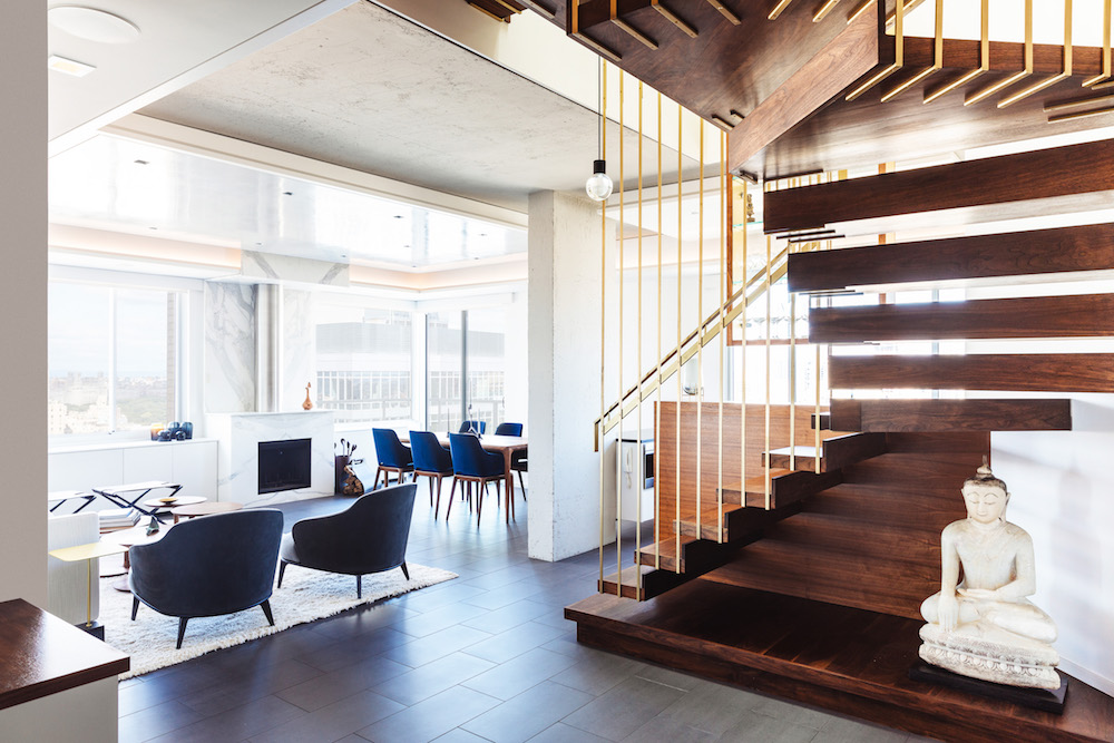
A sculptural staircase made from walnut and brass opens up the space and makes a contemporary statement. Deep blue leather chairs from Holly Hunt add a punch of color in the living room’s neutral-palette.
The first one announced itself just inside the front door of the 1,900-square-foot, two-bedroom residence. Visitors found themselves staring straight into a powder room tucked unceremoniously under a curving stair. The latter’s white-painted balusters and maple-stained banister and steps, recalls Wilkinson, “looked almost suburban.” To the left was yet another opportunity: a living room-dining room with a replace whose round-cornered bulk protruded bulbously into the room, stubbornly hogging attention from the spectacular Manhattan panoramas. A kitchen lay beyond the stairs down a short corridor, but because it was enclosed, it felt cramped.
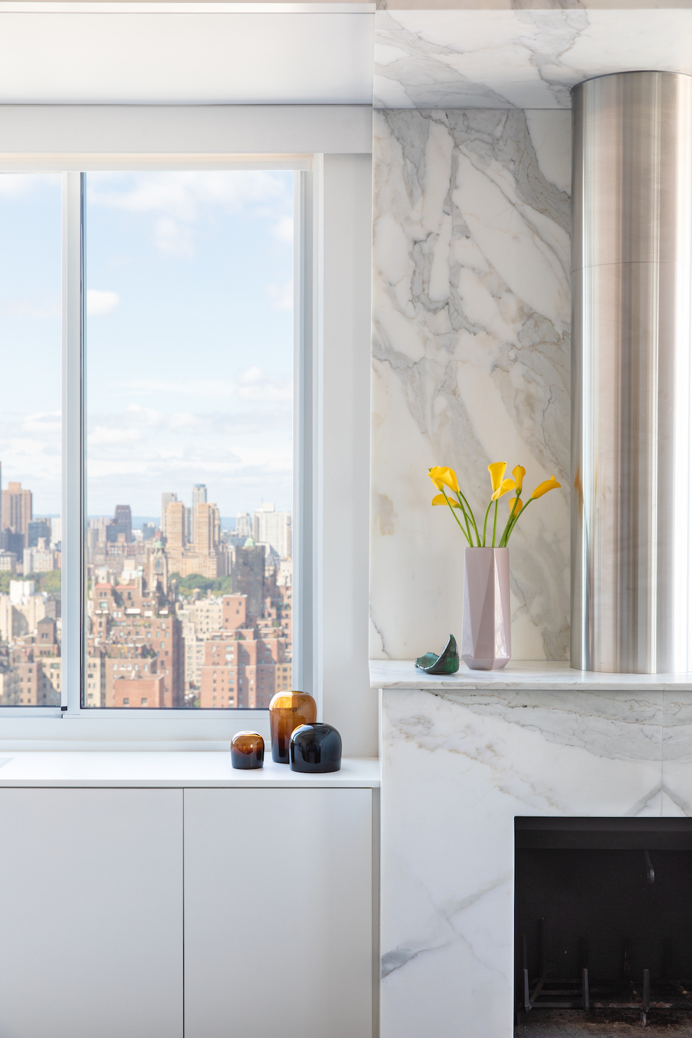
Statuary marble and a stainless steel exposed flue give the replace a contemporary and elegant presence.
Wilkinson’s first response was to gut and completely reimagine the interior. Because of the prominent placement of the stairs, the architect designed what is now a sculptural statement. The ascent now begins on a walnut plinth, rises to the right and eventually to the left in three sections. “Its shape is generated from the rough opening of the concrete slab overhead, which had many angles and sides,” explains Wilkinson. “It has the same outer geometry as the opening, so its aesthetic and utility are a complete response to existing conditions.”
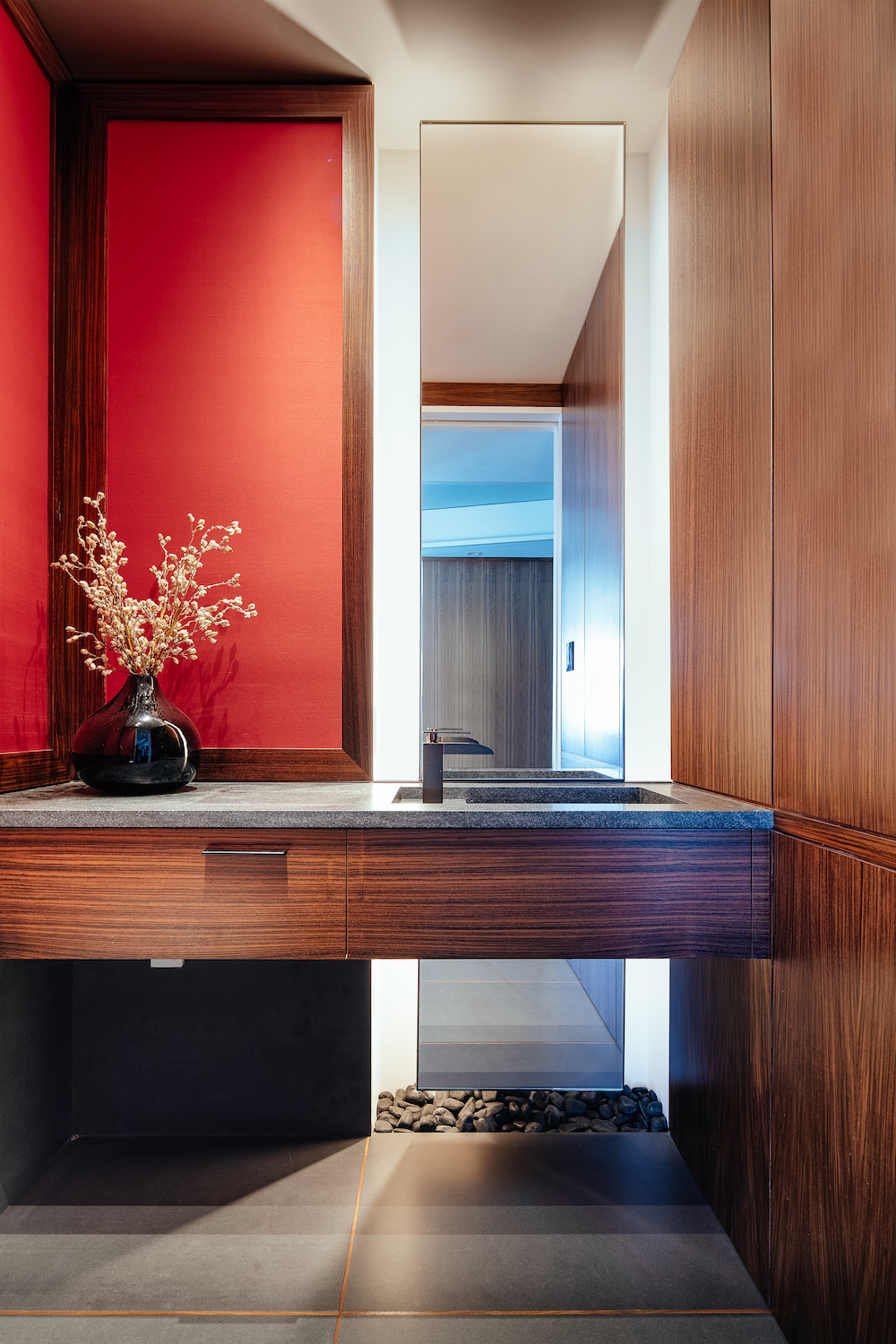
A chic powder room in warm red and wood, with a floor to ceiling mirror behind the floating vanity.
Wilkinson hung the staircase’s walnut treads on brass-plated steel rods suspended from the concrete slab. “They help support the stairs,” he says, “but they’re more of a sculptural gesture that makes them more enticing.” So does the natural light that now floods in from the kitchen. The back of the plinth accommodates a walnut volume that serves as a cabinet on the kitchen side and, since it is only a third of the height of the former wall, a less light-blocking separation between entry and kitchen.
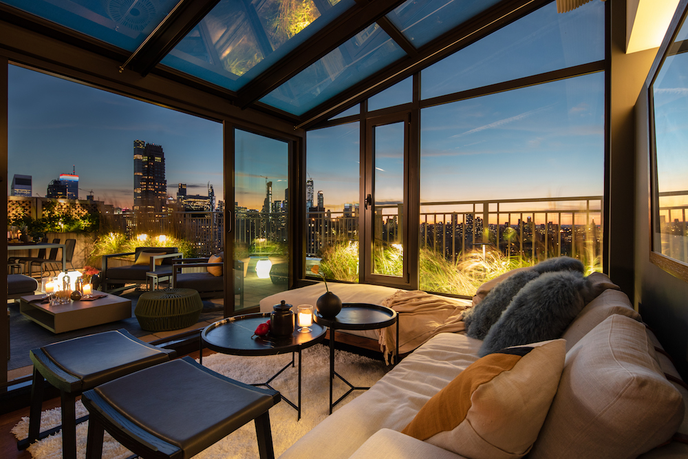
The rooftop greenhouse has a wall of sliding doors, giving it a cabana feel.
Wilkinson also convinced his client to remove the chunky over-mantel and expose the flue of the fireplace. “It was a huge imposition on the room,” he says, “and from an angle, it blocked most of the window on the right.” Now the fireplace wall, clad handsomely in statuary marble, is almost flush with the windows. “It exposes more of the view and also helps the room feel like one space rather than two.” Farrow & Ball-covered walls serve as a backdrop for touches of neutral and deep blue upholstered furnishings: a Minotti sofa, Holly Hunt leather chairs, a dining table from Stillfried Wien and dining chairs from Roche Bobois.
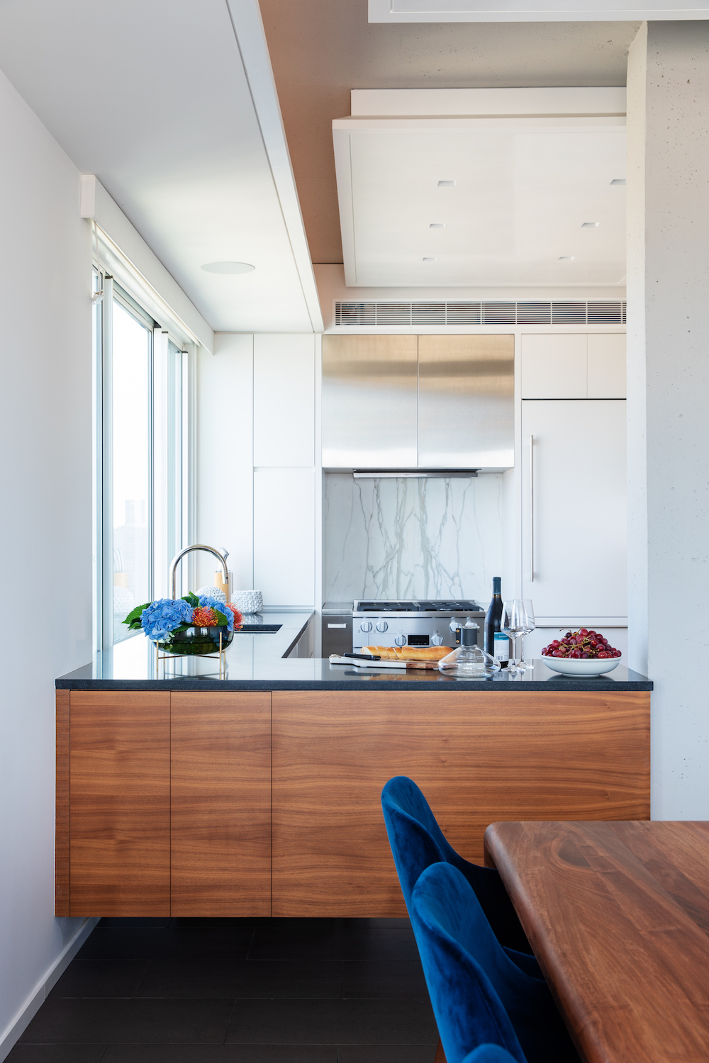
The formerly cramped kitchen is now opened up and streamlined with Miele, Sub-Zero, and Wolf appliances.
Upstairs the opportunity lay in resolving bizarrely angled spaces and having to walk through the master bedroom to get to the rooftop greenhouse room and terrace. By extending the walnut floor at the top of the stairs, Wilkinson created a corridor separating the master and the other spaces. Now, a left turn leads to the terrace and a right turn to the master, which reveals a wall of mirrored rosewood closets and, opposite, a cabinet that doubles as storage on the closet side and bed headboard on the other.
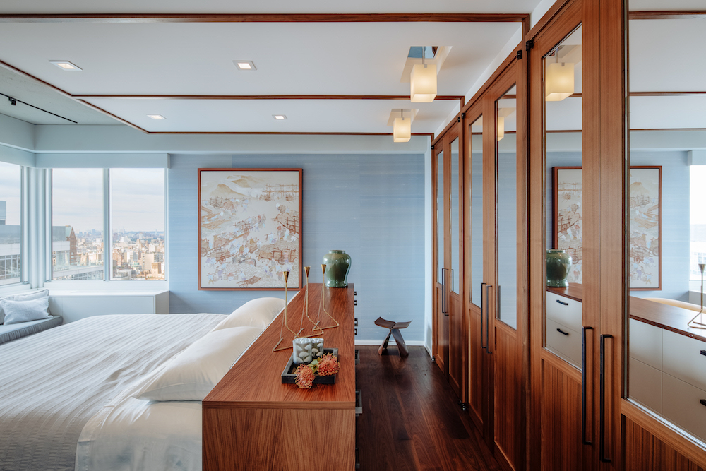
The master bedroom’s walnut floor continues from the staircase, and mirrored rosewood cabinets add tailored style.
The icing on the reimagined cake was the rooftop open space. “We replaced the greenhouse with a far superior version, making sliders that opened up fifty percent of the wall. We reoriented the furniture in the space so it feels like a cabana that opens onto the terrace.” A linen-covered Craft House sofa and B&B Italia ottomans make it feel casual and relaxed.
There were other opportunities, of course, but because Wilkinson’s solutions arose out of a responsiveness to the existing structure, the environment feels organic and appropriate.
